CELLZION
CELLZION
Project Type
Product
Deliverables
Design, Visuals, Graphics
Designer
Kaseub Song

Overview
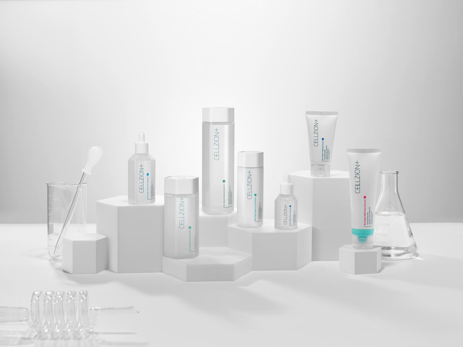
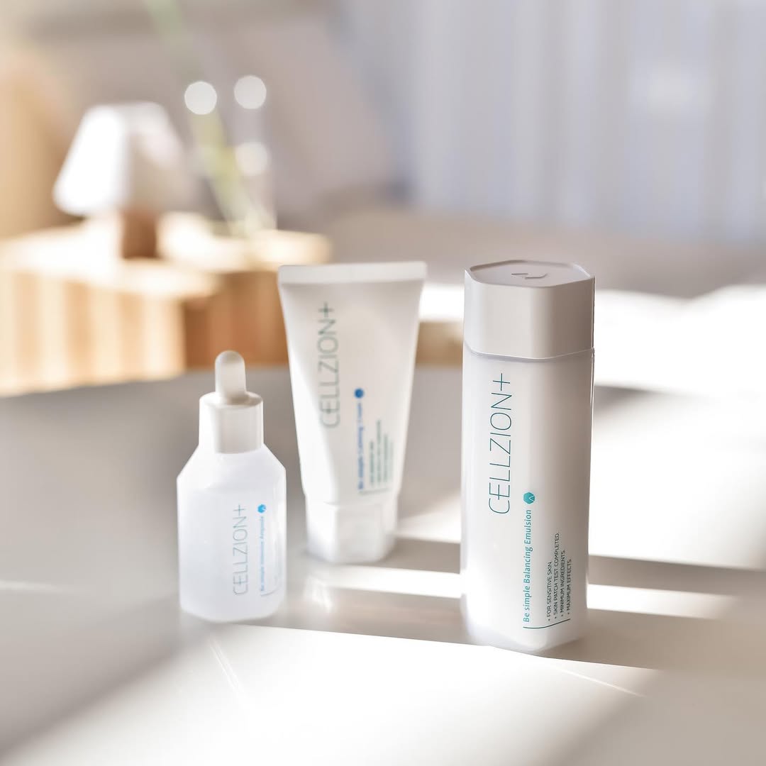
Derma product design CELLZION.
CELLZION, a Korean skincare brand focused on derma solutions, needed a visual identity that felt both scientific and modern. Our Korean designer, known for precise and elevated design work, developed a clean, clinical system across packaging and graphics. The overall design balances clarity with sophistication — anchored by a signature turquoise accent that adds a fresh, recognizable touch.


Our Approach
Design priorities and execution.
The visuals were built around functionality and trust. Clear hierarchy, refined typography, and minimalistic layouts made ingredient information easy to digest. The turquoise accent added a controlled pop of color — drawing attention without overpowering the brand’s clinical image.
Key elements included:
Structured, derma-grade packaging design
Signature turquoise accents for brand recognition
Balanced use of space and typography for clarity
Visuals for social media and website
Results & Impact
Strategic value for CELLZION.
With expert-led Korean design, CELLZION stands out in a crowded skincare market. The result is a brand image that looks trustworthy, export-ready, and premium. For brands entering the K-beauty or global derma space, this kind of design approach helps gain consumer trust, communicate value, and compete on a higher level.
Impact delivered:
Visually credible and differentiated brand presence
Consistent design language across product lines
Improved appeal for both local and international markets
Design makes the difference — especially where trust matters most.


Frequently Asked Questions
Who’s behind uuisbộr & what do you do?
What makes your creative studio different?
Do you work with international clients?
Do you offer one-time projects or long-term support?
How much do your services cost?
How do we get started?
CELLZION
CELLZION
Project Type
Product
Deliverables
Design, Visuals, Graphics
Designer
Kaseub Song
Overview
Derma product design CELLZION.
CELLZION, a Korean skincare brand focused on derma solutions, needed a visual identity that felt both scientific and modern. Our Korean designer, known for precise and elevated design work, developed a clean, clinical system across packaging and graphics. The overall design balances clarity with sophistication — anchored by a signature turquoise accent that adds a fresh, recognizable touch.
Our Approach
Design priorities and execution.
The visuals were built around functionality and trust. Clear hierarchy, refined typography, and minimalistic layouts made ingredient information easy to digest. The turquoise accent added a controlled pop of color — drawing attention without overpowering the brand’s clinical image.
Key elements included:
Structured, derma-grade packaging design
Signature turquoise accents for brand recognition
Balanced use of space and typography for clarity
Visuals for social media and website
Results & Impact
Strategic value for CELLZION.
With expert-led Korean design, CELLZION stands out in a crowded skincare market. The result is a brand image that looks trustworthy, export-ready, and premium. For brands entering the K-beauty or global derma space, this kind of design approach helps gain consumer trust, communicate value, and compete on a higher level.
Impact delivered:
Visually credible and differentiated brand presence
Consistent design language across product lines
Improved appeal for both local and international markets
Design makes the difference — especially where trust matters most.
Frequently Asked Questions
Who’s behind uuisbộr & what do you do?
What makes your creative studio different?
Do you work with international clients?
Do you offer one-time projects or long-term support?
How much do your services cost?
How do we get started?